Announcing the 2016 Color of the Year: Alabaster
Angela Poirrier
March 16, 2016
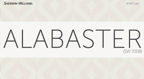
Sherwin Williams describes Alabaster as a color for a time of interconnected commotion and overstimulation. This year’s color offers a sense of personal solace and revival to weary minds and our team could not agree more. Alabaster provides a layer of neutrals, which we have talked much about. It lays the foundation for a space to be layered with textures and color.
Alabaster belongs in the family of warmth and tranquility but can hold its own in a pairing with contrasting colors, clean lines and sleek design. Its versatility is what makes it exceptional.
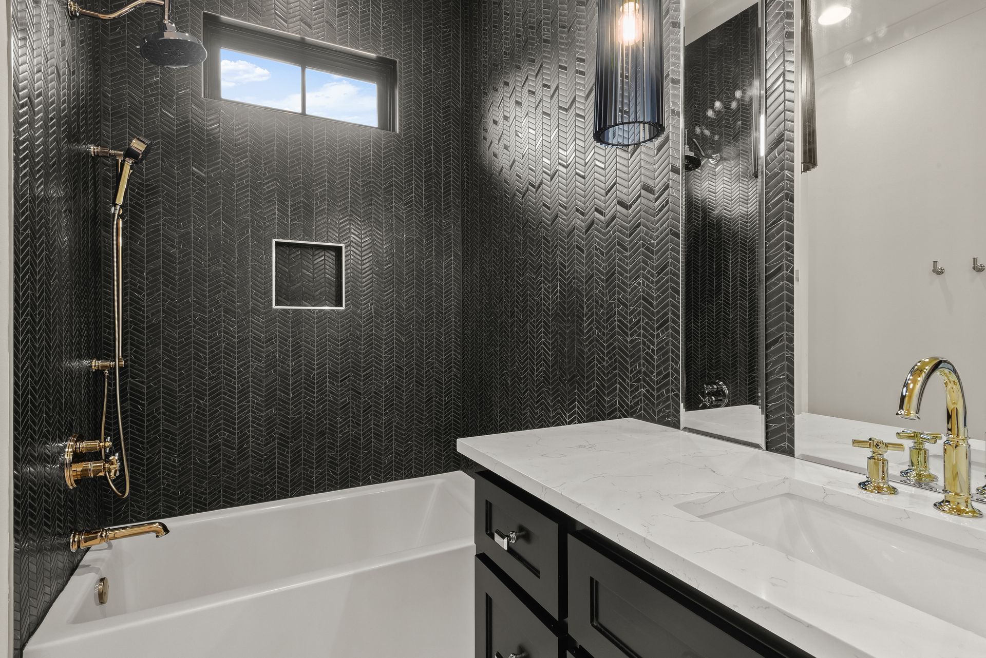
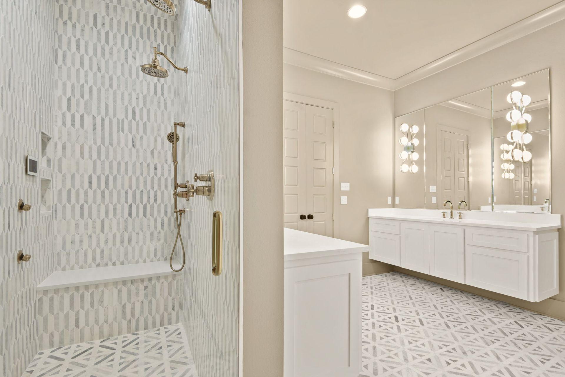
We often find that tones named as Color of the Year are striking, but this year’s selection is a step back to tie in the basics. As a team, we love a good white, but Alabaster brings complex undertones that work well with wood, fabric and stone.
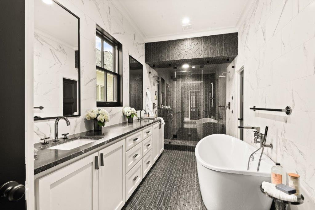
This is not a color that you have to design around such as 2015’s Color of the Year, Coral Reef. With Coral Reef we recommended pops of color because such a bold color can make a large statement in small amounts. Since neutral spaces of whites, creams and grays are trendy right now, Alabaster will supplement those colors by adding an additional layer of depth.
Because of the tones of this year’s color, our team is thinking beyond just pops of color in artwork or accent pillows. We want to show you how useful Alabaster can be in your home. Here are some ways that our team recommends adding in Alabaster:
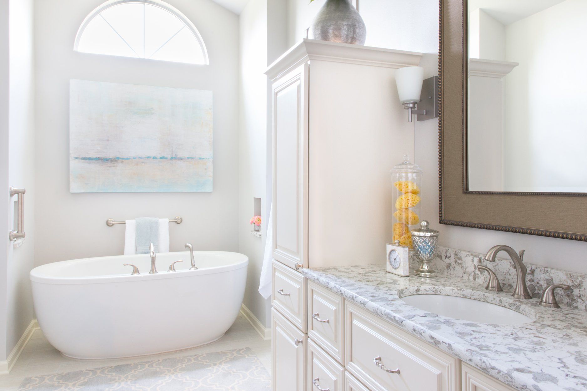
Paint Color -
This is a very versatile color that can be used in any room throughout the house.
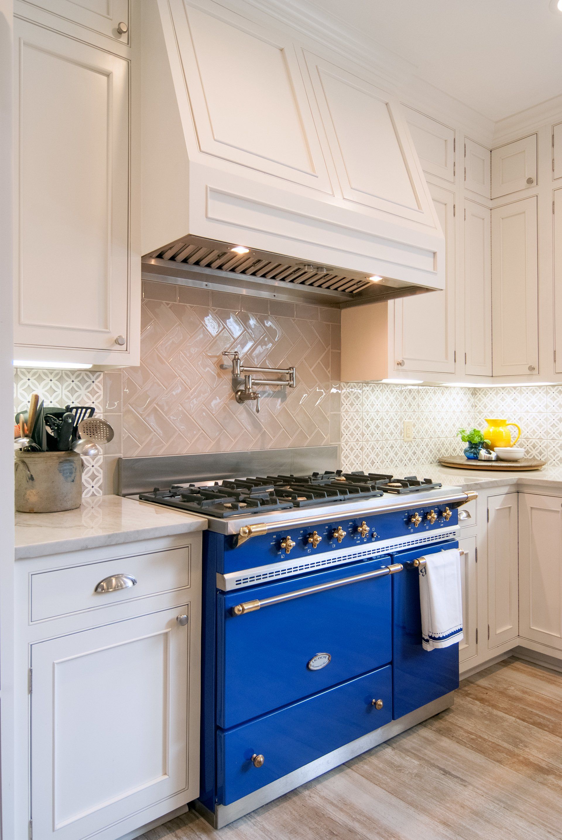
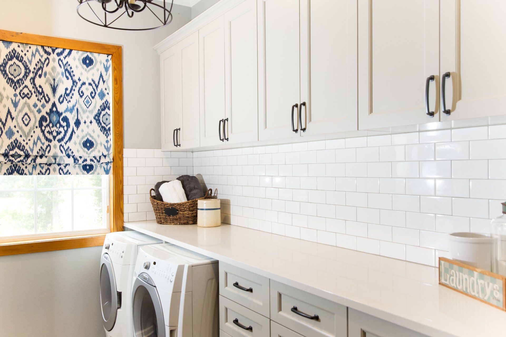
Kitchen Cabinets -
This muted hue can withstand the test of time as a member of the white family.
Chairs -
Imagine a dark stained wooden table and Alabaster fabric high back chairs. The style and grace will speak for itself.
Curtains -
Floor to ceiling curtains that perfectly frames the sunshine pouring in the house. Make Alabaster more interesting against a bold color or with a dramatic texture.
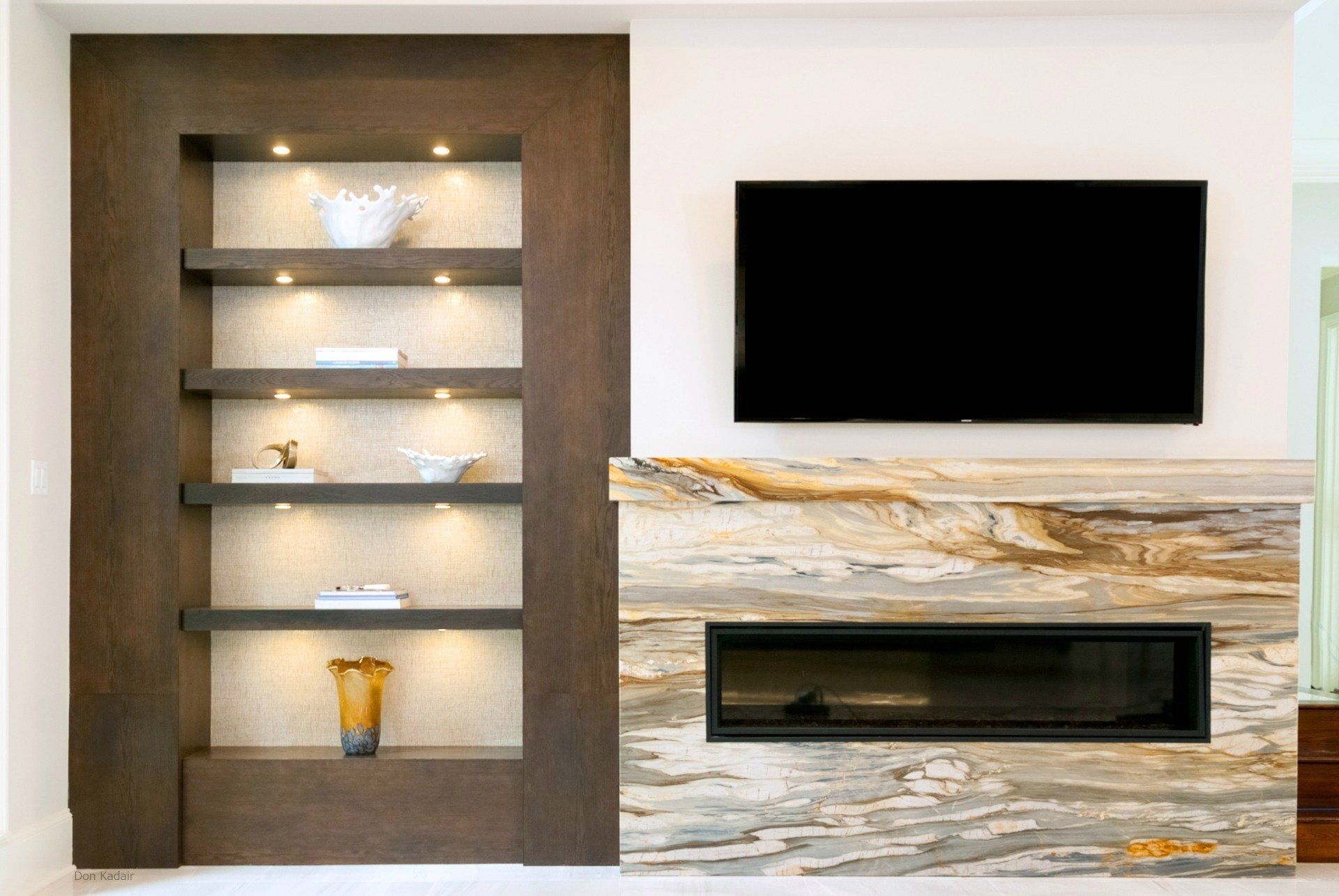
Millwork Think a shade or two beyond white for doors, molding, mirror trim, and woodwork throughout the house.
For some Pinspiration, check out our Acadian House Pinterest board on the color of the year.
